About

I'm Mike Pope. I live in the Seattle area. I've been a technical writer and editor for over 35 years. I'm interested in software, language, music, movies, books, motorcycles, travel, and ... well, lots of stuff.

Read more ...

Blog Search


(Supports AND)

Feed

Subscribe to the RSS feed for this blog.

See this post for info on full versus truncated feeds.

Quote

Disappointment is educational.

Jonah Lehrer


Navigation


<July 2025>
SMTWTFS
293012345
6789101112
13141516171819
20212223242526
272829303112
3456789

Categories

  RSS  
  RSS  
  RSS  
  RSS  
  RSS  
  RSS  
  RSS  
  RSS  
  RSS  
  RSS  
  RSS  
  RSS  
  RSS  
  RSS  
  RSS  
  RSS  
  RSS  
  RSS  
  RSS  
  RSS  
  RSS  
  RSS  
  RSS  
  RSS  
  RSS  
  RSS  
  RSS  
  RSS  
  RSS  
  RSS  

Contact Me

Email me

Blog Statistics

Dates
First entry - 6/27/2003
Most recent entry - 7/10/2025

Totals
Posts - 2664
Comments - 2684
Hits - 2,754,636

Averages
Entries/day - 0.33
Comments/entry - 1.01
Hits/day - 342

Updated every 30 minutes. Last: 1:30 AM Pacific


  02:26 PM

My first car was a 1968 VW Beetle. This was an honorable tradition in our family — my Oma drove a 1959 Bug, and my mother had a 1973 "Super" Bug. I am (was) a third-generation Bug owner.

Technologically, a '68 Beetle was trailing edge even in its day. Everything was mechanical; no fancy fuel injection, no electronic ignition, none of that. On the plus side, this retro-tech made it practical for an owner to do a lot of the maintenance themselves.

Being young, impecunious, curious, and naïve, I did just that. I got a copy of the venerable How to Keep Your Volkswagen Alive: A Manual of Step by Step Procedures for the Compleat Idiot by John Muir.[1] I studied that book for hours and hours, learning to do oil changes and tuneups — there were many greasy fingerprints on my copy. I eventually graduated to the daunting task (see earlier: naïve) of rebuilding the engine, led carefully by Muir's steps and Peter Aschwanden's brilliant drawings.


Aschwanden's illustration of a Volkswagen's brake system

(The engine ran and took me all the way from Denver to Seattle, so my work and/or the step-by-step instruction was apparently good enough.)

Doing a tuneup and oil change in my uncle and aunt's driveway, Bakersfield, Aug 1979. I look a little perplexed, not sure why.

Shifting gears (haha). Sarah's car died yesterday; she parked it for an errand, and when she was ready to head home, it wouldn't start. So this morning I cleaned the battery terminals, and that seemed to resolve the no-juice issue. But the car was running noticeably rough.

If this had been my 1968 Bug, I would have known what to do: get a small screwdriver and adjust the idle speed, which is something you can (could) do via a spring-loaded screw on the carburetor.

I knew, of course, that Sarah's car doesn't have anything so manual — we're several (many) decades beyond carburetors and idle-adjust screws. And I don't have a book about how to keep your 2005 Toyota alive for the compleat idiot. But now there's Google and YouTube.

What I discovered is that if the battery has died or been removed, you need to "reset the idle". When the battery is disconnected, the car loses its mind and has to be retaught basic functions, like what speed it's supposed to idle at, weirdly. There are no screwdrivers involved — basically, you start the car and then put it under different load conditions (A/C on, idling while in Drive) until its memory has been reset.

I don't entirely miss the days of having to get your hands dirty (literally) to do car maintenance. There are many ways in which having the car be "smart"[3] improves the performance and probably life of the car.

Still, it does feel a little more … distant? is that the word? … to not be able to find a knob or a screw someplace and be able to turn it to adjust the engine.

__________

[1] Is it possible this is the original "Idiot's" book? If not, it might be close.

[2] This book has a well-deserved cult following; he wasn't kidding that it was for the "compleate idiot", i.e., the completely inexperienced. As I have noted at other times, I learned a lot about both Volkswagens and technical writing by studying this book intently.

[3] "Everything's computer", to paraphrase our Car-Salesman-in-Chief.

[categories]   ,

|


  10:37 AM

Some fun ("fun") with AI today. To start, I saw this post on Bluesky:

Text:

its amazing how chatgpt knows everything about subjects I know nothing about, but is wrong like 40% of the time in things im an expert on. not going to think about this any further

The post is an AI repurposing of an observation about media accuracy. There are various names for this. One of them is the Gell-Mann Amnesia Effect, which is an observation about "the tendency of individuals to critically assess media reports in a domain they are knowledgeable about, yet continue to trust reporting in other areas despite recognizing similar potential inaccuracies" (Wikipedia).

Another name is Knoll's Law, which states that "everything you read in the newspapers is absolutely true, except for the rare story of which you happen to have firsthand knowledge".

It's unclear whether the person who made the Bluesky post is deliberately echoing these laws, but I wouldn't be surprised. And it's funny, either way.

As a perfect bonus to all this, I couldn't remember the name of the law, so I did a Google search. And Google's AI response did not disappoint — it gave me the wrong information:

Text:

The statement reflects a common observation about news reporting, often attributed to Betteridge's Law of Headlines, which suggests that articles with declarative headlines about complex topics are likely to be incorrect.

In case you don't already know, Betteridge's Law is "Any headline that ends in a question mark can be answered by the word no". Not only did AI suggest the incorrect term, it botched the definition of that incorrect term.

As it happens, because I have some experience with these various laws — that is, I had a little expertise — I knew that AI had gotten it wrong.

The observations about both media (Gell-Mann) and about AI are insightful and a bit disturbing. If we never really learned to be distrustful about media, we're that much less likely to distrust information that's provided by, you know, a computer. I shudder to think.

[categories]  

|


  08:00 PM

A Word macro/VBA tip. I'm writing this up primarily because I do this just seldom enough that I look it up every time. At least now I'll now where to look.

Suppose you're writing a Microsoft Word macro (in VBA). You want to add text to beginning and end of the paragraph. In my case, I'm adding HTML tags around the paragraph content, which is why this is interesting to me.

The Paragraph object has a Range property that returns a Range object. The Range object in turn supports the InsertBefore and InsertAfter methods. So you'd think that you could do this:

Dim para as Paragraph
Set para = ActiveDocument.Paragraphs(1)
para.Range.InsertBefore("<p>")
para.Range.InsertAfter("</p>")

This almost works. However, the closing </p> tag is added after the paragraph as a new paragraph:

Instead, do this:

Dim para As Paragraph
Set para = ActiveDocument.Paragraphs(1)
para.Range.Select
Selection.InsertBefore ("<p>")
Selection.MoveLeft unit:=wdCharacter, Count:=1, Extend:=wdExtend
Selection.InsertAfter ("</p>")

This is what's happening:

  1. Use the Range.Select method to select the paragraph. This gives you access to a Selection object.
  2. Use the Selection.InsertBefore object to insert your starting text before the Selection object range.
  3. Use the Selection object's MoveLeft method to reduce the size of the selection by 1 character (iow, by the size of the paragraph break).[1] This is the piece I'm always forgetting.
  4. Use Selection.InsertAfter to insert your closing text after the selection.

And look, it works very nicely. :)

__________

[1] I'm deliberately not using the work shrink here, because there is a Selection.Shrink method, but it doesn't allow you to shrink by just 1 character. At least, not that I've been able to find.

[categories]   ,

|


  09:54 AM

Today I learned two interesting and related facts about memory usage on my computer. (2-3/4 facts, actually)

Fact #1: audio crackling. I use a music streaming service, and over the last few days, the audio had started crackling in an annoying way. I initially thought it might have been a cable issue, so I fooled around with all the physical connections to my Bose subwoofer and speakers. This sometimes seemed to work, sort of. But no, the issue was just intermittent.

From a Quora (!) post, I learned that the culprit could be that I was running tight on memory in the computer. I fired up ye olde Task Manager. Indeed, when I first started it up and when the audio crackling was most evident, I had less than 10% free memory of the 16GB of RAM that's in my laptop.

Time to close some apps! And indeed, closing apps did bring down memory use, which did in turn seem to smooth out the audio. This probably explained why the crackling was intermittent; it coincided with occasions when various apps were really pushing on my RAM limit.

Fact #2: sleeping/discarded browser tabs. A notable memory hog on my computer is Chrome; I have 20+ tabs open at any given time, some of which I use constantly. For example, there's a cluster of tabs that I continually switch between when I'm doing my Old English homework.

I (reluctantly) closed a few tabs, and it did seem to reduce memory use; each tab I closed freed up more RAM. But I didn't want to close all the tabs — these are my emotional-support tabs. haha

However! It turns out that you can put Chrome tabs to sleep, so to speak. (Technically, for Edge the term is "sleep"; Chrome uses the term "discard".) When a tab is asleep/discarded, you still see the tab in the browser window, but it's a kind of placeholder; the content of that tab has been flushed out of memory. When you go back to the tab, the browser reloads the page. Each tab I put to sleep/discarded freed about 2% of memory.

Fact #2-1/2. From this exercise, I also learned about a UI thing I'd noticed. When a browser tab in Chrome is asleep/discarded, sometimes there's a gray dotted circle around the tab name:

Fact #2-3/4. By the way, to discard Chrome tabs, go to chrome://discards and use the links at the right side of the page to discard or load a tab.

[categories]  

|


  10:34 PM

Recently I was at a grocery store in our neighborhood that still does a lot of business in cash. As I was waiting, I watched the cashier ring up the customer in front of me. The cashier deftly took the customer’s bill—a $50, I think—and counted out change. When it was my turn, I said “It looks like you’ve been doing this for a while”. “Oh, yes”, she said. “35 years”.

During my college years (1970s), I had a kind of gap year during which I worked for Sears, the once-huge department store. I was hired as a cashier, and the company put us through an extensive training program for the position.

For example, that’s where I learned something that I saw the grocery-store cashier do: when you accept a big bill from a customer, you don’t just stuff it into the tray. You lay it across the tray while you make change. That way, if you make change for a fifty but the customer says, “I gave you a hundred”, you can point at the bill and show that that’s what they’d given you.


Before my time

My cashiering days were at the beginning of the era of computerized cash registers (no big old NCR ka-ching machine for us). Although our register could calculate change, they still taught us how to count out change manually. (One method is to count up from the purchase price to the amount the customer gave you, as you can see in a video.)

We also learned to handle checks, which included phoning to get an approval code for checks over a certain amount. We learned to test American Express travelers checks to see if they were authentic. We learned to handle credit cards, which we processed using a manual imprinting machine that produced a carbon copy of the transaction.

We also learned to be on guard for various scams, such as the quick-change scams that try to confuse the cashier, as you can see in action in the movie Paper Moon.

There was of course lots more—cashing out the register, doing the weekly “hit report” of mis-entered product codes or prices (this was also before UPC scanners), and many other skills associated with being at the point of sale and handling money.

During my son’s college years (late 2000-oughts), he also worked as a cashier, in his case for Target and for Safeway. I quizzed him about his training. He remembered that the loss-prevention people at Target warned them about the quick-change scam, and it even happened to him once while he worked at Safeway.

But he doesn’t remember much training about how to handle change; at a lot of places, coin change is automatically dispensed by machine into a little cup. He does remember learning how to handle checks.

Most of their training, he remembers, was about how to use the POS terminal[1]—how to log in, how to enter or back out transactions, etc. A POS terminal is, after all, a computer—they were being trained in how to manipulate the computer, and less so than in my day about how to handle cash money.

Shortly after I had my grocery-store experience with the experienced cashier, I was in line at a local coffee shop. The customer ahead of me paid in cash. When I got to the counter, I asked the amenable counter person, “This is going to be a sort of weird question, but how much training did they give you in how to handle cash?” “Little to none”, was her report.

And Friend Alan recounted this experience recently on Facebook about a cashier trying to figure out how to even take cash:

It might seem like old-school cashiering skills are becoming anachronistic. It’s not unusual in my experience that small shops and pop-up vendors only take cards, using something like Square. Frankly, I was surprised that the coffee shop with the informative counter person even took cash.

Moreover, we customers are more and more becoming our own cashiers. Many stores nudge customers toward self-checkout kiosks, in part by reducing the number of cashiers so that it’s faster to use the self-checkout.[2] The logical conclusion to this effort is the cashierless store (aka “Just walk out store”), where computers just sense your purchases and charge you.

Still, it’s not like cash is going to go away. Even in the age of debit cards and Venmo, people will still want to use cash for various private transactions.[3] Moreover, not everyone has a bank account, or wants one. Although individual merchants might decide to go card-only, many will still find it to their benefit to take cash.

That probably will continue to include the grocery store where I met the experienced cashier. For the sake of that store, I hope that she is able to pass her experience and training on to other cashiers who work there.

__________

[1] The initialism POS is a good shibboleth. Do you immediately think point of sale? Or do you think part of speech? Or maybe piece of sh*t?

[2] We now fill our own carts, check our own prices, empty the cart at the checkout, scan our items, bag our own stuff, and serve as our own cashiers. Some users (example) therefore find it insulting that we also now have to meekly stop and have security check our receipts and purchases (“I'm not interested in proving that I did your job for you”.)

[3] For the time being, dispensaries in states where pot is legal are usually cash-only businesses because marijuana is still illegal per federal law and credit-card companies don’t want to get involved in that gray area.

[categories]   , ,

[4] |


  08:16 AM

Twenty years ago today, I posted the first entry on this blog. As I’ve recounted, I wrote some blog software as an outgrowth of a book project I’d been working on. The book purported to teach people how to program websites, and a blog seemed like a good exercise to test that.

It’s hard today to remember how exciting the idea of blogs was 20 years ago. Before then I’d contributed some articles to a couple of specialized publications, and I was proud to see those in print. But dang, with blogging, you could sit at your desk and draft something, press a button, and presto, anyone in the (connected) world could read it instantly.

In the early days, there was handwringing and skepticism about blogs. “The blogosphere is the friend of information but the enemy of thought,” according to Alan Jacobs.[1] And in an editorial in the Wall Street Journal, Joseph Rago dismissed blogs as “written by fools to be read by imbeciles.”

Despite these Insightful Thoughts from pundits, somehow blogging survived. (haha) In my world—software documentation—blogs turned out to be perfect for a niche that otherwise could be filled only by conference presentations, or occasional articles, or books. Blogs became a way to get news and information out fast. They were also unfiltered, as compared with company-created documentation: authors could provide personal and opinionated information. And in blogs like The Old New Thing (about Windows) and Fabulous Adventures in Coding (about programming languages), to name only two, readers got all sorts of insights into how and why software was developed as it was.

And it was all free!

Once blogging overcame the initial doubts, people and companies were keen to learn how to do it. In the mid-oughts, I was teaching classes in Microsoft Word and in editing at the local college. The woman who ran the department called me up one day and said “I think we need a class about blogging.” So I put together a curriculum and taught that class for a couple of years. Which naturally I blogged about.

A bit ironically, in my own blog I didn’t follow some of the advice I was dispensing. My subject matter was (is) all over the place, as the Categories list on the main page suggests. I also was not very disciplined about adhering to a strict schedule, about planning my posts around specific dates or events, or about optimizing for SEO. (In my defense, I’ve never thought of my blog as a commercial project, so I wasn’t very concerned about maximizing traffic, building a corporate or personal brand, etc.)

And here it is, 20 years on. Counting this entry, I’ve made 2,648 posts. A rough count tells me that I’ve written almost 900,000 words. The pace on this blog has slowed considerably, but the process has been valuable to me in many ways:

  • Blogging is writing. Putting together all those blog posts has given me lots of practice and I’m sure it’s improved my writing skills.
  • It’s a resource. Countless times I’ve reached back into the blog to look something up that I wrote long ago.[2]
  • It’s helped people. Perhaps the high point was when some Microsoft documentation pointed to one of my blog entries as the quasi-official story on something. Per my reckoning, the blog has gotten about 2.5 million hits, so hopefully some folks have gotten some value there.
  • I "met" many people via blogging, and some of those in real life, even.
  • It’s helped me in my career. I’ve used the blog to (in effect) draft things that were later turned into “real” documentation. I’ve used blog entries as writing samples when applying for jobs.

But over time, a couple of things changed. One was that Google killed Google Reader, a tool for tracking blogs, citing declining usage. This seemed to indicate that the popularity of blogs had crested, but I think that that change itself also contributed to making it harder to keep up with blogs.

The real change, of course, was social media. In particular, Twitter, which sometimes has been referred to as a “micro-blogging platform”, really took the air out of blogging. (For example, you're probably reading this because of a link on a social media site, not because you saw the post in your aggregator app.)

Although Twitter isn’t a good way to capture long-form posts, its immediacy became the default first-reaction medium for breaking news. And it was a perfect way to post from a smartphone; Twitter’s original 140-character limit was dictated by the constraints of the SMS protocol that was used with phones. Some will remember that as with blogging, early Twitter faced skepticism—“Why would I want to know what someone had for lunch?” for example—but it, too, found its footing.

But, gee, what goes around. In 2012, right about the time that Google Reader went away, the Medium website was launched. “Williams, previously co-founder of Blogger and Twitter, initially developed Medium as a means to publish writings and documents longer than Twitter's 140-character (now 280-character) maximum.” (Wikipedia) And there’s also Substack at al., platforms that let authors publish newsletters, as they call them, and push them to your email. Maybe I’m a bit cynical, but the difference between a blog entry that appears in your aggregator and a newsletter that appears in your inbox seems pretty small to me.

Although the software that originally inspired this blog (Web Matrix) is long gone, the blog persists. For about 19 years, I’ve been telling myself that I’ll rewrite the code to modernize it. We’ll see.

It’s had a good run, this blog, and I think it still has value to me and who knows, maybe to others. I’ll check in again in five years. :)

[1] He updated that thought a few years later.

[2] The funniest example of this was just recently. I was having an issue with the blog, so I did a search on the error message I was getting. Google pointed me to an entry on my own blog that outlined the fix.

[categories]   , , ,

|


  04:34 PM

Part 4 of a series about what I did to self-publish an ebook and then a paperback version of it.

This is the final part, which is about creating a manuscript for print and then publishing the book on the Amazon site as a (print-on-demand) paperback. This entry covers a lot:

About formatting for print

When you format for print, what you see is what you get. Unlike an ebook, your choices about typeface, font size, paragraph spacing, etc. are reflected directly in the final product. And you need to worry about page layout: page breaks, page numbers, headers and footers, etc.

When I was formatting the paperback version of the book, I pulled books off my shelf and studied their formatting and layout. There's a whole art and science to book layout, of which I know some rudiments. I reckoned I could do worse than try to copy how they did things in professionally formatted books.

Because someone asked me about this, I'll note that the book uses only two fonts. Body text is Times New Roman. I used a sans serif font (Calibri Light) for headings, headers/footers, and a few other purposes, as I'll explain. My choices here were all conservative and possibly even boring. I don't know enough to try to be creative in this sphere.

The Kindle paperback template

One of the formatting decisions for the paperback edition is to choose the book size ("trim size"). Amazon has Word templates that you can download for different trim sizes. The templates include sections that have predefined margin sizes and that are set up to have right/odd pages (recto), left/even pages (verso), and gutters. When they say "template," however, they don't mean a Word template—a .dotm file—just a .docx file with predefined settings and some sample content.

I made a copy of Amazon's 6 x 9in.docx template, which is a standard size for trade paperbacks (in the US, anyway). Their template has different sections (in the Microsoft Word sense of "section")—a section for the title page, another section for the copyright page, and sections for the table of contents, the acknowledgements, and of course a section for the main text. The point is to allow you to control pagination and headers/footers separately for each of these sections.

Once I had the template, I copied the contents of my original manuscript (not the ebook manuscript) into the section of the 6 x 9 doc that was for the body of the book. Then I did the title page in the title-page section, and so on. Then I got to work at formatting this manuscript for a print book.

If you've been following along, this means I now have three versions of the manuscript (original, ebook, print). As I was fooling around with book formatting, I found more content issues, so I had to make changes in all three versions of the document.

Paragraph formatting

It's common in books for text to be justified. In running text, there aren't blank lines between paragraphs. The first line of a paragraph is indented unless it follows a heading or other break in the text. Books also have page headers and footers.

To implement all this, I tweaked and amended the formatting of the Word styles I was using. Here's a diagram that captures a lot of this, with descriptions afterward.


(Click to embiggen)

A. Body text

I adjusted the settings for the Normal style for book layout: I set alignment to justified and I indented the first line. I also set line spacing to 1.12 to give the text a little breathing room but not too much.

For the typeface, I chose Times New Roman 11 pt, and I used the font-formatting option to set kerning for 11 points and larger. My thinking here is that the tool probably has more smarts built into it than I do about text layout, so I should take advantage.

B. Widow and orphan control

You don't want page breaks to leave individual lines dangling at the end or beginning of a page, aka widows and orphans. As with book design generally, there's a craft to this. I enabled the Widow/Orphan control setting for the Normal style. (Probably not what a professional book designer would do? I don't know.)

C. Body text after headings

I had to create a new style (Body after heading) that was the same as Normal except that the first line wasn't indented. I then had to go through and manually apply that style to any paragraph that followed a heading, a diagram, a blockquote, an example, or a list.

D. Headings

For headings, I used the contrasting, sans serif typeface (Calibri Light), bold. I ended with Heading 1 at 18 points and Heading 2 at 13 points.

For the heading paragraphs, I enabled Keep with next and Keep lines together, but I disabled widow/orphan control. I also set some space before and after the heading-style paragraphs.

E. Page headers

For print, you also need page headers. The Kindle template is set up to allow different headers on odd (recto) and even (verso) pages. As noted, it also lets you set different headers and footers for different sections.

In the body part of the book, for the headers on even (left) pages, I used the name of the book. For the headers on odd pages, I used the STYLEREF field set to Heading 1; this shows the text of the current Heading 1 paragraph. (See Rhonda Bracey's explanation.) As you can see from the diagram, the result was that when the book was open, the title was on the top left and the current entry was on the top right.

There are no headers or footers for the introductory sections of the book (title page, copyright page, TOC).

For the page headers I used the contrasting font (Calibri Light) and set it to 10 pt instead of the 11-pt size that's in the body text.

F. Page footers

I used the page footers for page numbers. I set up page numbering to start at 1 in the main section of the document. You can't see it in the diagram, but for the preliminary pages in the book (table of contents, intro), I set up page numbering to use small roman numerals (i through iv). The section for the title page and copyright page has no page numbering.

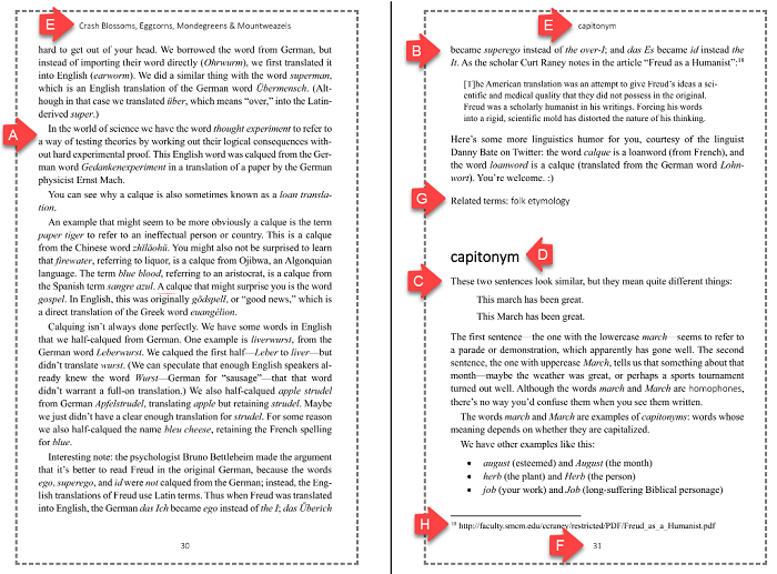
In the original manuscript, the "Related terms" list at the end of each entry was a Heading 2 paragraph followed by a paragraph styled Related terms list. (Earlier explanation) I'd created this style to be able to control its formatting separately from the spacing (etc.) of the Normal style. For the print book, I thought having an H2 + a separate paragraph took up too much space in the book. I ended up removing the text "Related terms" as a separate heading and I just added it to the beginning of the list. This was a manual process, with an assist from find-and-replace.

This is what it looks like in the ebook manuscript:

And this is what it looks like in the print manuscript:

H. Footnotes

I changed the settings for the Footnote style to use be 9.5 points. However, I didn't use footnotes in the print book the same way I had in the original manuscript, as I explain next.

Rethinking footnotes

As noted before, I had a lot of notes/footnotes in my original manuscript. For the ebook, I'd done work to make these into links to end notes at the end of each entry.

For the print book, given especially the small format (6x9), the footnotes took up a lot of space at the bottom of the page. (IOW, they didn't look as clever in the print book as I'd thought when I wrote them.) Also, I needed footnotes for a different purpose.

So I removed almost all of the informational footnotes. Instead, I integrated the footnote text into the body text, sometimes parenthetically.

A big dilemma was what to do about links. The ebook had links to outside sources, and it had many, many cross-links within the book to related terms. I ended up doing several things. This included adding a paragraph in the introduction that spelled out my conventions, which I'd also had to do in the ebook.

For external links, I went through one by one, copied the URL of the target, and put that target URL into a footnote. In a few instances, the URL was so long that I used a URL shortener. After I'd added a footnote for an external link, I removed the Hyperlink style of the original link. This was a manual process.

In case you're wondering, I experimented with putting the URLs directly into the body text. Not only did this look awful, but it messed up the formatting (justification) in the paragraph.

The original looks like this in the ebook manuscript:

And it looks like this in the paperback manuscript:

I also removed some of the external links altogether. Some number of the links felt like they weren't all that necessary—more CYA than FYI. The rough rubric I used was whether I thought that the intended reader for the book would find the external source interesting enough. I did this pretty quick, so I probably made a few bad calls, dunno. This means that there are some small content differences, citation-wise, between the ebook and the paperback.

For internal links—cross-references to other entries in the book—I created a new style called Cross-reference. This new style uses the contrasting font (Calibri Light) and has no color or underlining. Since I'd already removed all the external links, I changed the remaining instances of Hyperlink style to use the Cross-reference style. (You can do this in the Styles pane, as Rhonda Bracey explains.)

The result was that something that originally looked like this in the ebook:

… looks like this in the print book:

I'm reasonably happy with this solution.

Hyphenation

When text is justified, you can get some weird spacing in a paragraph unless you enable hyphenation. So in Word, I enabled automatic hyphenation. Word did a pretty decent job of hyphenating words.

What about indexing?

An ebook can get by without an index if you accept that searching the ebook is a workable substitute. Print books ... well, they should have an index, right? I did not create one/have one created. My very weak justification is that my book is in some ways an alphabetical reference, so if I want to look up, say, "biscuit conditional," why, it's right there in the table of contents. But I do recognize that there are many terms in the book that don't have headwords and that the book definitely would benefit from a real index. Perhaps for the next edition?

Checking the layout

Ok, whew! After I'd made these adjustments to the formatting for the print book, it was time to check everything. I saved the document as a PDF file (the format that Amazon wants) and then paged through it. I did all of these checks:

  • Make sure new each new section starts on an odd (recto) page. Not each entry, but each section (TOC, Introduction, etc.)
  • Check for bad page breaks e.g. leaving a heading by itself, or awkward gaps between entries. I fixed some of these with small adjustments, such as slightly resizing images, or adding or removing small amounts of space around images, block quotes, or cites. This is part of the craft of book design, and there's much here for me to learn.
  • Check for widows and orphans.
  • Check for bad hyphenation. I attempted to review every instance of auto-hyphenation in the book. In the end I found only, like, 4 words that were awkwardly split. Interestingly, while checking, I discovered that Merriam-Webster and American Heritage sometimes have different ideas about how to hyphenate.
  • Check that the TOC page numbers were correct. I had to remember to refresh the TOC every time I did anything that affected page flow.

This was an iterative process—if a change affected page flow, I had to recheck everything that followed the change. I don't know how many times I went through the book, but it was a lot. And naturally I still missed stuff, because self-editing is hard.

Configuring KDP for publishing the paperback

After all this reformatting, I was ready to set up the print book on Kindle Direct Publishing (KDP). I created a new project and chose the option to create a paperback. Some of this process is similar to how you set up a Kindle ebook—do you have your own ISBN? What price do you want?

But the print version has a couple of additional options and steps. What color paper do you want? Should the cover be matte or shiny? These choices seemed straightforward to me.

They also ask about Territories, which has something to do with distribution rights. I went with the default ("All territories"). They also ask about Primary marketplace, which is basically which national flavor of Amazon you want to use for your book—for example, Amazon.com versus Amazon.co.uk. This is interesting for international sales and for calculating prices and royalties. I have no advice for you, though.

A few print options required some work.

Cover art

For the ebook, you have to provide just a cover image. But for a printed book, you have to provide the entire cover: front, spine, back. Ideally, they want a PDF or TIFF file that has text and art for this three-sided cover. They have a template for this.

Fortunately, they also provide the Cover Creator tool. The tools let you enter text for the summary (back cover), author bio (also back cover), and for the spine (title and author). You also upload the cover image. The tool has a certain number of knobs and levers, like font choices and a few layout options. It's okay; I wasn't super pleased with the resulting cover. If you have the skillz, you can probably create a much better cover with e.g. Photoshop. This is what the cover looked like in Cover Creator when I was done:

Upload and preview text

For the text, you upload a PDF file that you create from your Word document. They then really want you to preview the book layout. You might think that you'd already done that in Word and then perhaps after you created the PDF file. But the KDP preview is definitive—it shows you exactly what your printed book is going to look like. I'd encourage you to flip through your entire book yet again, again looking for weird page breaks, odd formatting, or whatever.

If you spot something (I did, multiple times), you can fix it in the Word file, re-save as a PDF, re-upload the PDF, and re-preview the book. This sounds tedious, and it is, but in the greater universe of book publishing, it's actually kind of amazing that you can do this from the comfort of your computer.

Ready? Not quite yet

Once you've set all the options and you've signed off on the preview version of your book, you're ready to go. Oh, wait! Not quite.

Before you finish-finish (contrastive-focus reduplication, it's in the book), you should proof your book. Order a proof copy and wait impatiently until it arrives. Then scrutinize it page by page, line by line. I guarantee that you'll find things you want to change. (If you're me, you'll still miss stuff.)

With your marked-up proof copy in hand, go back to the Word file for your print version and make the fixes. (You might even need to go back to the KDP version of your Word doc.) Then do all the review stuff again (don't forget to update the TOC) and save it as a PDF. Check the PDF. Re-upload the PDF to KDP and preview it there again.

Ok, now for real

When you've decided that your post-proof Word file is as perfect as you can make it (perfect used in a non-absolute sense, it's in the book), you're really ready. After you've uploaded the perfect version of your PDF file and previewed it, click Publish Your Paperback Book. Shortly thereafter your book will appear on Amazon.

Because the book is published on demand, and because they have to mail you the thing, it takes a while to get a copy. I think I waited about two weeks for my copies, but YMMV.

Linking book formats

A final note: when you have both a Kindle version and a print version of your book, you can link them in KDP. I believe that the effect is that Amazon has one listing for your book but shows both editions. Seems like a no-brainer, but you do have to explicitly do this.

Lessons and what's next

A few thoughts about what I'd do differently next time, and some things I might still do.

  • (Possibly) Test the entire process first by publishing a shorter, easier book. I would have learned a lot by writing and publishing, say, a 30-page giveaway book.
  • For some things, it would have been useful to start with the print version and then adapt that for the ebook version. Either way, though, there would still have been manual work in converting one to the other.
  • Stay my hand with the footnotes. Those proved to be a lot of work, and as noted, in the print edition I ended up incorporating many of those notes back into the text anyway.
  • Edit and proof even more. I went over the manuscript and the proof copy many times, and I still find stuff, oh well.
  • Get someone to design a better cover. Especially I'd get someone who can create a PDF file with the front, back, and spine laid out per the KDP spec.
  • Get my own ISBNs. That way I could publish the book on different platforms, not just Amazon.
  • Professional book design?
  • Index for the print version.

After thinking about it for a while, I think I'd do the same thing again that I did with links. For the ebook, I'd keep external and internal links and mark external ones. For the print book, I'd convert external links to footnotes and convert internal links to special formatting for print. I'm interested in other people's opinions about how to handle this.

Someone asked whether the book is available other than through Amazon, since some people don't like that platform. At the moment, no. I think I can make the book available on other self-publishing platforms based on the existing ebook and paperback manuscripts that I have. I'll need to investigate. Is the book available in a bookstore? Sadly, no.

And someday, I suppose, I'll get around to releasing the second edition. :)

[categories]   ,

|


  03:15 PM

Part 3 of a series about what I did to self-publish an ebook and then a paperback version of it.

I mentioned earlier that I published using Kindle Direct Publishing (KDP). To do that, you create a KDP project in Kindle Create (KC), as I covered in Part 2. You create one project for your Kindle ebook. If you want, you can create additional projects for other formats, which I'll get to in Part 4.

To get through the KDP publish process, you need to create and decide on a few things. Here's what I cover in this entry.

The book description

You must provide the text that Amazon uses on their site to describe your book, up to 4000 characters. It's probably a good idea to have that text ready to go when you start your KDP project. Here's where the description text shows up in Amazon:

ISBN

All books can have an International Standard Book Number (ISBN). (I could call this an ISBN number, which would be a redundant acronym phrase, as covered in my book, haha.) In the US, you can buy ISBNs from Bowker at $125 a pop or $295 for 10. Because each edition of your book—including ebook vs print—uses a different ISBN, the package deal seems like it could be useful.

Amazon says that Kindle books are not required to have an ISBN. Because I really wasn't sure what to do, I skipped the ISBN for my Kindle edition. For other formats, like paperback, Amazon will give you a free ISBN, and that's what I did for the print edition.

Important point: if you want your book to be available anyplace other than through Amazon, you must provide your own ISBNs. If I were doing this all over, I'd probably buy my ISBNs independently so that I could use them as I wanted.

You can read more about how ISBNs work and whether and how to get them in Publishing: Everything the Indie Author Needs to Know about ISBNs for Self-published Books.

Cover art

Even though you're publishing an ebook, you need to have cover art. The cover appears in your Amazon listing and in readers' Kindle libraries. Ideally, you'd probably hire a professional for your cover art. (I didn't, and it shows.) KDP wants you to upload a .tif or .jpg file that's (ideally) 2560 pixels high by 1,600 pixels wide. There's a page on the KDP site that provides some more details about cover art specification.

I got help from one of our art- and tech-savvy kids. I created the speech-bubble word cloud on wordcloud.com and exported that, and then Art Kid imported that into Canva.com and we did the rest there and then exported a high-quality JPEG file. (She was taking my lead, so the amateur-ish nature of the cover is not to be blamed on anyone but me.)

Anyway, have your cover art ready to go when you start your KDP project.

Configure KDP for publishing the ebook

When you've got your manuscript and other prerequisites sorted out, you go to the KDP site and sign in with your Amazon credentials. Then click the big yellow Create button to begin your project. This starts a multi-page configuration process.

You upload your cover art and content on the second page. For the text, you upload the .kpf file that you created with Kindle Create.

After you've uploaded the manuscript, you can preview the book. Even though you might have previewed the book in Kindle Create, KDP really wants you to preview the book during the configuration process. Launch the previewer and have a look. If you want to make changes, you go back to Kindle Create (or all the way back to your Word doc), make the change, and then re-upload the .kpf file. When you're happy with the book, then—gulp—click the accept button.

Keywords and categories

You can specify up to 7 keywords that describe your book. This is basically SEO-lite, I guess? I used the keywords language, vocabulary, and linguistics.

You also have to enter "browse categories" based on the existing categories that Amazon uses on its site. Because my book was about language, I ended up using these two categories:

Nonfiction > Language Arts & Disciplines > Linguistics > General
Nonfiction > Language Arts & Disciplines > General

I admit that I don't understand how the categories that KDP was offering map to categories I see on the Amazon site itself. That said, you do have to pick two from the categories they offer, so one does one's best.

Pricing

The last page of the KDP configuration is about sales and pricing: where to sell the book, how to sell it, and what to charge for it. This is confusing, because they give you a range of prices and royalties, and unless you've already studied up, you might not know how your choices here affect the availability of your book. I chose $9.99 because I got the sense that that's what Amazon was trying to get me to do. :)

Ready? Go

After you've finished the KDP configuration, you click Publish Your Kindle ebook, and you're done. Within a pretty short time (a day? less?), your book will be live on Amazon as a Kindle book and you can tell all your friends.

Up next, Part 4: Formatting and publishing the paperback

[categories]   ,

|


  03:10 PM

Part 2 of a series about what I did to self-publish an ebook and then a paperback version of it.

When I began working on creating a Kindle version of the book, I duplicated my manuscript—I had the original Word doc and then a Kindle Direct Publishing (KDP) version of the Word doc, where I made all the Kindle-specific changes that I describe below. This meant that if I decided to make a content change, I had to make it in both documents.

Here's what I cover in this part:

Some Kindle basics

It helps to understand a couple of things about how Kindle works. (I'm not an expert, so bear with me.)

  • Readers can pick a preferred typeface, font size, paragraph spacing, paragraph alignment (left, justified), and some other layout features. Being able to change these settings is one of the great features of reading ebooks, actually. This means that although you can set these things in the manuscript that you upload, readers might change them. That said, you can control a few formatting settings, like relative font size.

  • A lot of Kindle e-reader devices don't support color, so color by itself isn't going to be significant for readers using those devices. You'll want to try to be sure that everything in your manuscript also works with a non-color display.

  • People can switch between dark mode (light text on dark background) and light mode. One person noted that this was an issue with graphics—if someone is reading in dark mode, a light-colored graphic really pops out, sometimes in unpleasant ways. Spoiler: I have no solution to this issue.

When I wrote my original manuscript, I did a few things that I had to ponder when converting to Kindle (and later to print):

  • I had a lot of links to websites, i.e. external to the book.
  • I had a lot of internal links, i.e. cross-references to other entries in the book.
  • I had a lot of footnotes. Some were asides, some were additional information, some were … well, anyway, I had a lot of them.

I realized that a lot of people would be reading their Kindles offline—that is, in airplane mode. I wanted to make it clear to readers when a link was external, so that they didn't click it and then get the "You're offline, do you want to turn off airline mode?" message over and over. Therefore, in my KDP manuscript, I added a caret (^) to every single external link, like this:

I did this by hand, but the process was a little easier because in my Word file I used the Link Checker tool from AbleBits. Among other features, this tool produces a list of all the links, so that helped me home in on the external links.

Because the convention of using ^ after a link to mark it as external wasn't necessarily obvious to readers, I added a section in the introduction to the book (and only the ebook) that explained this convention. I did this although I don't think people read introductions, and I also feel fairly strongly that formatting shouldn't require explanation.

Footnotes introduced a different problem. The conversion tool for Kindle (see later) can handle footnotes fine. In fact, better than fine; it can generate footnotes that include Wikipedia-style back links to return you to where you clicked the footnote.

However, the converter turns footnotes in your Word file into endnotes in Kindle. Because I had over 100 footnotes (probably unwise), it would have meant an enormous section at the end of the book, and I didn't want that.

So I created chapter endnotes, in effect. In the Word doc, at the end of each chapter (i.e. each entry), I added the words "Note 1," "Note 2," etc. and then the text of the corresponding footnote. I restarted the note numbering for each entry, and I manually made sure the numbering was sequential in the text and in the footnotes. Then I used Word bookmarks and internal links to manually create the links to these chapter endnotes. I also manually created the backlinks to return to where the footnote was marked. This sounds confusing, but here's an example:

Needless to say, this was a lot of work, and somewhat error prone. More than once I questioned the wisdom of my approach and of footnotes generally. Nevertheless, that's what I did. (I can explain this process in more detail if you're interested.)

I'm pleased to say that this worked great. It imported perfectly into the Kindle book and has exactly the effect I wanted.

The Kindle Create tool

Amazon has a free tool that's a huge help for creating books: Kindle Create (hereinafter KC).

The tool lets you import a .doc/.docx file, fix up the formatting (with some limits), preview the result, and then create a file to submit for publishing. Although you can edit and format most text, you can't edit everything—for example, at the time I was using the tool, you couldn't make any changes in lists.

The tool also lets you create a title page, a table of contents (TOC), an Acknowledgments page, About the Author page, and so on. I had already created those in my original manuscript, so I didn't really take advantage of those features.

Importing and applying styles and formatting

The KC tool supports a modest selection of styles, which they call elements. These include Chapter Title, Subheading, Block Quote, and Body Text. These are fine for a lot of uses, such as novels.

Headings as chapter titles

When you import your Word file into KC, KC recognizes text that's styled as a heading (any heading, not just Heading 1 paragraphs) and marks those headings as Chapter Title elements. When the import process finishes, KC offers you suggested chapter titles that shows you everything that it thinks is a chapter title:

You really want to scrutinize this list and unselect the elements that are not real chapter titles. You should do this right at the beginning, because it's easier to do this now than to fix up the formatting later. When I did this, some of the non-heading paragraphs were marked as Chapter Title elements, I don't know why. I just unselected those as noted here.

All other text

As far as I can tell, anything other than a heading style from the Word file is imported as Body Text.

However, KC imports the formatting (as opposed to the style) of text in your Word document, up to a point. Kindle renders body text using the reader's choice for typeface and font size. Beyond that:

  • Character formatting. KC imports italics, bold, color, underline, and other basic character formatting. It retains font sizes that you've applied, but not typefaces/font families. For example, because KC doesn't import font families, I don't know how to get it to import a monospace font like Courier or Consolas.

  • Paragraph formatting. In my manuscript, the body text was aligned left; in other words, I didn't explicitly set alignment to center, right, or justified. When KC imported the text, paragraphs were justified, which is the Kindle default. (As noted, Kindle readers can change this.) During the import process, KC retains paragraph formatting such as line spacing and indentation. If you've aligned paragraphs center or right, KC retains that. If a paragraph has a non-default font size, the import process retains that, too. For example, I set the font size for my blockquote paragraphs to be 1 point smaller than for body text, and the import process respected that.

  • Page breaks. Page breaks are retained.

  • Links. Links in the Word file are imported as links in the Kindle format.

After you've imported the Word file, you can (mostly) manually edit and format text in KC. The formatting options are fairly rich: you can set font (including font face), color, bold, etc. For example, if you want to set some text to monospace, you can do that in KC with manual editing. For paragraphs, you can set indentation, spacing, and justification.

You can also "cascade" your format settings for the element you're playing with. (This is like CSS, or in Word, like making a change in Word to the style definition for that text.) For example, by default, KC renders all Chapter Title elements (headings) using all caps. However, you can select a heading (element: Chapter Title) and then set casing to UPPER CASE, lower case, Title Case, or None. I did this—I selected a heading, set casing to None, and then made sure that the Cascade formatting changes for elements option was selected:

This told KC to leave the casing of my headings as I had set them in the manuscript. Because I enabled the "cascade" option, it made this change to all my headings.

I mostly did not make text or formatting changes in KC (except for headings, see previous). Instead, when I wanted to change the formatting, I went back to the KDP version of my Word doc, changed formatting there, and then created a new KC project and re-imported my text. I ended up doing this many times—4? 6? 10? I forget. I did it however many it took me until I'd ironed out all the issues I found in KC and until could import a clean doc. I did this because I knew I was going to need to do further work in Word later and I wanted the changes to be in the Word doc.

Tables

My manuscript had several tables in it, but I'd read repeatedly that ebooks don't handle tables well. For small tables, I converted them to graphics. Here's an example of a small table that I converted to a graphic—I just took a screenshot of the table in the original manuscript:

A lesson I eventually learned here is that before you take the screenshot, make sure that the text of the table is perfect. And make sure that spell-check and grammar-check haven't left squiggly lines under words in your table.

For large tables, I didn't try to create graphics from them. Instead, I converted them into lists. In HTML terms, I emulated a description list, though I did that manually, not through styles.

Here's what one of those tables looked like originally:

And here's what I converted it to:

To do this, I created a special paragraph style for the terms and descriptions so that they'd be indented and so they'd have a smaller font size. I had to manually convert the original table to this new set of styles. But once I'd done that, the KC tool respected these formatting choices when it imported the text.

Still, lesson learned: if you know you're going to publish in an ebook format, stay away from tables.

Graphics

I had read that KC could import embedded graphics directly, and that was my experience. fwiw, I had only JPEG and PNG graphics.

KC imports any alt text that you've assigned to graphics in the Word file. But you can also write alt text in KC if you didn't do it in Word.

In KC, you can resize a graphic using t-shirt sizes: Small, Medium, Large, or Full. If you choose Large or Full, the graphic is centered. If you choose Small or Medium, you can also specify whether you want text to flow to the left or right of your image.

As I noted earlier, someone pointed out to me that graphics will pop out at them uncomfortable way if they're reading in dark mode. As of now, I have no answer to that issue.

Previewing in KC

The editing layout that you work with in KC is a pretty good approximation of what the text will look like. But KC also has a Preview mode that lets you get an exact sense of how the book will look like in different form factors. You can choose to preview in Kindle E-Reader, Tablet, or Phone device types.

When you're done with KC

When you've got your text done in KC, you save your project as a .kpf file. That's the format you use for the next stage, which is to set up your Kindle book for publishing.

Up next, Part 3: Publishing the ebook

[categories]   ,

|


  01:39 PM

I self-published a book recently. (Crash Blossoms, Eggcorns, Mondegreens & Mountweazels: 101 Terms About Language That You Didn't Know You Needed) I used Kindle Direct Publishing (KDP), which lets you set up and then publish Kindle ebooks, paperbacks, and hardbacks. The print versions are print-on-demand.

I learned a few things about the process (by no means everything), so I thought I'd capture so that I have a reference for the next time I decide to do this. :)

I've done this in a multi-part blog post series.

A couple of the individual parts are sort of long, sorry. I didn't want to split them up any more than this, though. Here's what's in this first part:

The Word file

I wrote the manuscript in Microsoft Word. For better or worse, Word files (.doc, .docx) are a (the?) favored format for importing into the KDP pipeline.

Using styles

My advice is that if you're intending to publish to both Kindle and as a print book (paperback or hardback), use styles in Microsoft Word. As I'll explain later, this will make it easy for you to convert things like headings for the Kindle, and to convert hyperlinks into something else in the print editions.

For most publishing needs (fiction, say), it's probably sufficient to use styles for headings and body text. I wanted to use some special formatting, so I created custom styles. (I love styles.) In the sections that follow, I have a short list of the styles I created. These are specific to my scenario, which is a non-fiction book; I'm not suggesting that you follow this lead. If you're not a style nerd, skip to the General formatting section later.

Paragraph styles

Normal. The body text for my book was all in the Normal style. For the original manuscript, it doesn't really matter what your style settings are. The settings for your Normal style don't become important till you're formatting for print, which I'll explain when I get that far.

Example. I wanted a special style for paragraphs that were for examples. I defined this style as .25 inch indent, non-default paragraph spacing. In my manuscript, I had this as a contrasting (sans serif) typeface—that didn't matter for the ebook, but it did later for the print book.

Blockquote. I created a different paragraph style for when I had a longish cite from another source. This was indented, and it used the default typeface, but 1 point smaller.

Related terms list. At the end of each entry I have a "Related terms" heading followed by a paragraph that lists related terms in the book. I wanted to be able to control the formatting of this list independently of the body text. This ended up helping a little later for the print edition.

Character styles

I really went to town on character styles, many more than I needed. A couple of notes about character styles.

Word as word. I created a character style for when I wanted to call out a term that I was talking about. This renders in the default font and in italics.

Word as word emphasis. This style was for when I wanted to call out an individual part within a word-as-word. This renders as italics + bold.

Example emphasis. A style for calling out something within an example. This uses the same font that I used for the Example paragraph style, plus italics + bold.

Hyperlink. I had links in my manuscript, both external links (to websites) and internal ones (to other sections of the document). When you create a link in Word, it styles the link as Hyperlink (blue + underline). It became important later to be able to work with this style.

As I say, I had many styles. You can see that a lot of the character styles end up rendering the same: italics, bold, italics + bold, etc. This is generally true of character styles—there are a limited number of ways that you can format words. Still, it's useful to have "semantic" styles: styles based on the purpose of the formatting, as opposed to what the text looks like.

Using semantic styles did end up being beneficial. For the most part, the look of the text didn't matter much for the ebook—Kindle has its own ideas about how to render text. (Some of the styling information translated to the ebook when I exported it to Kindle, as I'll eventually explain.) Styles were particularly useful later when I formatted the book for print—when I was laying out the print version, using styles made it easy to change my mind about how I wanted things to look in print. That said, I would have been okay with fewer character styles and with using direct formatting for the few oddball instances.

General formatting

In addition to formatting using styles, I did the following formatting.

Non-breaking spaces. I added non-breaking spaces when I wanted a space but didn't want Word to break a line before or after a piece of punctuation.

Non-breaking hyphens. I used non-breaking hyphens when I didn't want Word to break a line before the hyphen:

So that's what I did in the Word manuscript. In the next installment, I'll talk about how I worked with the Kindle Direct Publishing tools to prepare my manuscript as an ebook.

Up next, Part 2: Formatting the Kindle ebook

[categories]   ,

|